
iHeartRadio’s mobile app users rely on the mini player to control their music, but functionality is obscured and interactions can be clunky. How can we make the mini player easier to use?
My Role
UX research, strategy, and visual design.
Timeline
Dec 2020 - Feb 2021
Partners
Anna Tucci, Product Manager
Philip Kim, UX Design Lead
Heather Vaughn, UX Research Lead

The original mini player. Swiping left revealed the skip button and remaining skip count.
Overview
iHeartRadio’s mini player (seen above) was long overdue for a redesign.
Leadership took note of a UX research study that showed pain points users experienced when trying to connect a device to iHeartRadio. The only way a user can do this is by interacting with the mini player, thus providing an opportunity for an update. Timelines were short and scope was small, but we were able to align on design goals:
Create a prominent connections entry point. Users were confusing the connections label for content metadata.
Rethink iconography. Users are more likely to recognize OS-specific symbols (AirPlay, Chromecast, etc), not representations of devices (speakers, TVs, etc).
Reduce barriers. If a user did tap on the connections label it opened the full screen player, not the connections menu.

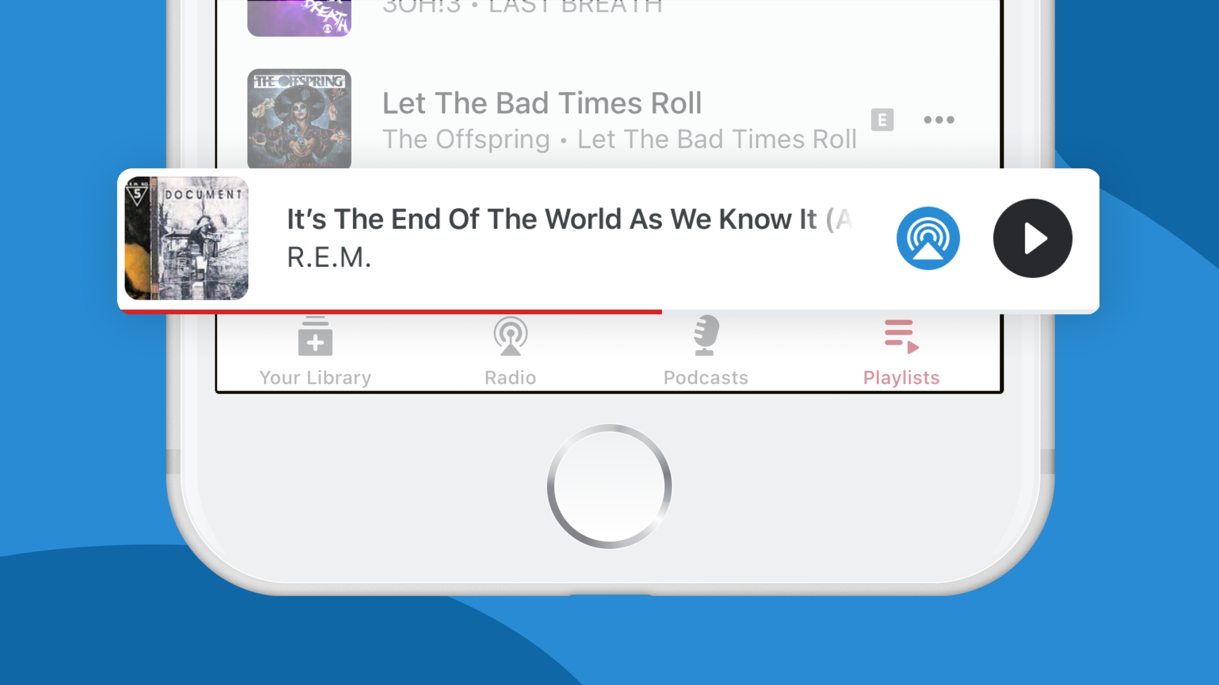
The winning mini player concept. Buttons are at the far right for easy access, and album art gives more context to the content played.
Challenge
I shared some early concepts with the team (example seen above), but some were concerned the tap area needed to launch the connections menu interfered with the existing swipe-to-skip gesture. Based on data I collected from competitor analysis, I knew Spotify already had an exposed connections entry point and a similar gesture to skip to the next song. An easy way to validate our mini player concept without extending timelines was to test their experience instead.

Spotify’s mini player.
Solution
After bouncing ideas off my team’s UX Research Lead, I quickly built an unmoderated test in UserTesting to answer these key questions about Spotify’s interface:
Can users swipe to skip the currently playing track without interference from the connections entry point?
Can users recognize the connections entry point on the mini player?
Are users aware that these features exist and are accessible from the mini player?
Do users find any value in these features?
Participants were current Spotify users and had varying familiarity with the app. The age of participants ranged from 45-55 to match the most common iHeartRadio demographic. Five participants had an iOS mobile device, and five had an Android mobile device, bringing the total number of participants to 10.
Results
The outcome of the test was overwhelmingly positive, and I was able to deliver the following recommendations to product and leadership:
Keep iHeartRadio’s skip pattern. There were no observed issues when participants swiped to skip a song, however several said they would have used the feature sooner if they knew it existed. We’d need to educate our users to avoid this scenario.
Use OS-specific iconography. Using representational iconography as the connections entry point wasn’t enough for participants to understand the feature. This bolstered prior research suggesting users are more familiar with OS-specific iconography (AirPlay, Chromecast, etc).
Consider more entry points. Many participants navigated to settings or tapped into content overflow menus looking for the connections entry point. Even if iHeartRadio’s connections entry point is obvious, users still may go elsewhere based on existing mental models.
Speak their language. Despite referring to features and pages using Spotify’s own terminology, participants were not familiar with given names and terms, adding confusion to some tasks.
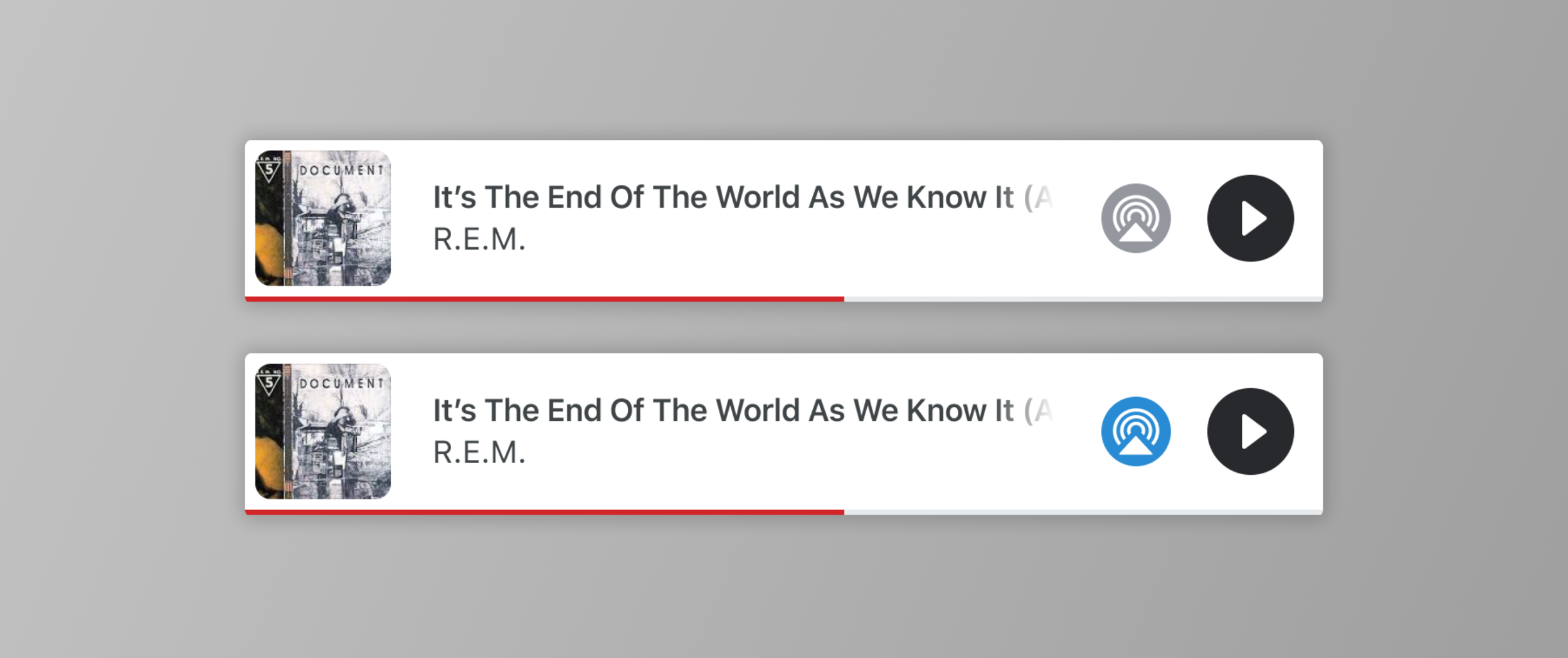
The final version. The button changes to blue when a device is connected.
Conclusion
The team decided to move forward with my concept. Ongoing discussions with leadership opened the door to further refinement, and with the support of a UX Design Lead the new mini player (seen above) was successfully delivered and is due for release in Spring 2021.